Vue.js 3 Composition API Async Lazy Loading & Suspense Tutorial
In this Vue tutorial we learn how to perform asynchronous operations with the Composition API.
We cover the suspense component and a custom loader, default and fallback slots, error handling and how to lazy load async components.
Lesson Video
If you prefer to learn visually, you can watch this lesson in video format.
Lesson Project
If you want to follow along with the examples, you will need to create an app generated by the Vue CLI as well as the following extra component.
- src/components/AsyncComponent.vue
The project should look similar to the following.
project-name/
├── src/
|   ├── components/
|   |   └── AsyncComponent.vue
|   └── App.vue
How to use the async setup option
If we want to perform async operations in the setup option, we can mark it as async and use await inside.
async setup () {
  // perform async operation
  await something()
}
As an example, let’s say we want to fetch data from an external API in the AsyncComponent . We would mark the setup option’s method as async and use await on the fetch method.
<template>
  <h2>({{ post.id }}) {{ post.title }}</h2>
  <p>{{ post.body }}</p>
</template>

<script>
import { ref } from 'vue'

export default {
  async setup() {
    const post = ref({
      id: -1,
      title: '',
      body: ''
    })

    await fetch('https://jsonplaceholder.typicode.com/posts/1')
      .then(response => response.json())
      .then(data => {
        post.value.id    = data.id
        post.value.title = data.title
        post.value.body  = data.body
      })

    return { post }
  }

}
</script>
In the root App component, we’ll invoke an instance of the AsyncComponent .
<template>
  <async-component />
</template>

<script>
import AsyncComponent from './components/AsyncComponent'

export default {
  components: { AsyncComponent }
}
</script>
But if we run the example in the browser, nothing is rendered on the page.
That’s because to use async setup in a component, the parent component must use that component in a <suspense> tag.
How to use the suspense tag
The suspense tag is a special component that renders fallback content until a condition is met.
To use it, we wrap an instance of a component in open-and-close suspense tags.
<suspense>
  <component />
</suspense>
To demonstrate, let’s change our example to have the AsyncComponent inside suspense tags.
<template>
  <suspense>
    <async-component />
  </suspense>
</template>

<script>
import AsyncComponent from './components/AsyncComponent'

export default {
  components: { AsyncComponent }
}
</script>
If we run the example in the browser, we’ll see the post content on the page.
Default and Fallback slots
We can also use the suspense component’s default and fallback slots to show some sort of loading indicator while it waits for the child component’s setup to resolve.
<suspense>

  <template #default>
    <component />
  </template>

  <template #fallback>
    <p>Loading...</p>
  </template>

</suspense>
To demonstrate, let’s change our example to show the AsyncComponent by default and show a simple paragraph with loading text as the fallback content.
<template>
  <suspense>
    <template #default>
      <async-component />
    </template>
    <template #fallback>
      <p>Loading...</p>
    </template>
  </suspense>
</template>

<script>
import AsyncComponent from './components/AsyncComponent'

export default {
  components: { AsyncComponent }
}
</script>
It’s possible that you won’t see the fallback loading message because the component loads to quickly.
In that case, open the browser’s dev tools and go to the Network tab. From the Throttling dropdown, choose Fast 3G.
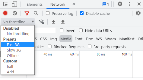
Keep the dev tools open and reload the page. You should see the loading message appear for a second or two.
How to handle errors
If the async operation fails and the component’s setup raises an error, we can capture the error in the onErrorCaptured lifecycle hook, imported from the ‘vue’ package.
The hook takes a callback with the error as an argument and can return false if we want to indicate to Vue that the error has been handled, or true if it should stop when the error is caught.
onErrorCaptured(err => {
  // handle error

  // if error handled
  return false
  // otherwise
  return true
})
As an example, let’s add it to our root App component and log the error to the console.
<template>
  <suspense>
    <template #default>
      <async-component />
    </template>
    <template #fallback>
      <p>Loading...</p>
    </template>
  </suspense>
</template>

<script>
import { onErrorCaptured } from 'vue'
import AsyncComponent from './components/AsyncComponent'

export default {
  components: { AsyncComponent },
  setup() {
    // capture error
    onErrorCaptured(err => {
      console.log('Error:',err)

      return true
    })
  }
}
</script>
note The errorCaptured hook only works on nested components.
How to lazy load an async component
We can optimize our application by loading components that perform async operations on demand. For example, a user doesn’t need to see a hamburger menu until they click on the menu button.
To do this, we use the defineAsyncComponent function from the core ‘vue’ package. The function takes a single argument.
- A callback function that imports the component we want to lazy load.
tip Because the component is dynamically imported, we don’t need to import it explicitly at the top of the script block. However, we still need to register the component in the components option.
const ComponentName = defineAsyncComponent(
  () => import('path-to-component')
)
To demonstrate, let’s update our example to lazy load the AsyncComponent .
<template>
  <suspense>
    <template #default>
      <async-component />
    </template>
    <template #fallback>
      <p>Loading...</p>
    </template>
  </suspense>
</template>

<script>
import { defineAsyncComponent } from 'vue'

// import component as 'AsyncComponent'
const AsyncComponent = defineAsyncComponent(() =>
  import('./components/AsyncComponent.vue')
)

export default {
  // still needs to be registered
  components: { AsyncComponent }
}
</script>
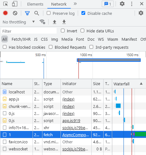
If we run the example in the browser, it will still show the post contents as we expect. But now, our component lives in a separate chunk.
To see the chunk, open the browser’s dev tools, go to the Network tab and reload the page. You should see some files called 1 or 1.js .
How to use a custom loader instead of suspense
We can tell Vue that we want the async component to display its own loading message, instead of the fallback suspense content.
The defineAsyncComponent function can take a config object as its argument. In the config object, we can specify the following options.
- loader is the component we want to lazy load.
- loadingComponent is the component we want to use that contains a loading message.
- suspensable tells Vue if we want the fallback content to be from the custom component or the suspense boundary.
const AsyncComponent = defineAsyncComponent({
  // async component to lazy load
  loader: () => import('path-to-component'),
  // component with loading message
  loadingComponent: loadingMessageComponent,
  // don't bubble up to 'suspense'
  suspensible: false
})
To demonstrate, let’s convert our example to use the config object with a new component as the loading message component.
- src/components/Loading.vue
The project should look similar to the following.
project-name/
├── src/
|   ├── components/
|   |   ├── AsyncComponent.vue
|   |   └── Loading.vue
|   └── App.vue
The Loading component will have a simple paragraph with red colored text.
<template>
  <p style="color:red">
    Custom Loading...
  </p>
</template>
The root App component will import the Loading component and set it as the loadingComponent option in the config object. We’ll also make the suspensible option false to ensure this loading message is used and not the one from the suspense object.
<template>
  <suspense>
    <template #default>
      <async-component />
    </template>
    <template #fallback>
      <p>Loading...</p>
    </template>
  </suspense>
</template>

<script>
import { defineAsyncComponent } from 'vue'
// import loading message component
import Loading from './components/Loading'

const AsyncComponent = defineAsyncComponent({
  loader: () => import('./components/AsyncComponent.vue'),
  // use 'Loading' as loading message
  loadingComponent: Loading,
  // don't use suspense
  suspensible: false
})

export default {
  components: { AsyncComponent }
}
</script>
If we open the Network tab in the browser’s dev tools again, throttle the connection and reload the page, we should see the red custom loading text show for a second or so.