Svelte.js 3 Component Basics Tutorial
In this tutorial we learn about Svelte's component architecture and Single File Components (SFCs).
We cover .svelte files, the root App component, how to create and use components and component rendering.
Lesson Video
If you prefer to learn visually, you can watch this lesson in video format.
Lesson Project
If you want to follow along with the examples in this lesson, you’ll need a Svelte app that was cloned with degit or scaffolded with Vite
If you already have an app from previous lessons, you can use that instead.
Svelte's Component Architecture
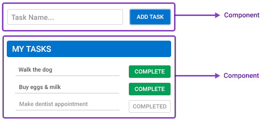
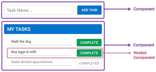
Svelte’s architecture is based on the idea of coupled components. A component is a piece of the UI that should only perform a single task. These components are then combined into “pages” that forms the full application.
As an example, let’s consider a simple Task List app.
We have a component that’s responsible for adding a new task, and one that’s responsible for displaying all the tasks in our list.
Each component is a self-contained unit of HTML, CSS and Javascript. Everything it needs to function is contained in the component’s file.
A component can also be made up of multiple other components. For example, an active task can be its own component, as well as a completed task.
There are many ways components can communicate with each other and share data, like props and events , or get data from an external resource.
'.svelte' files (Single File Components)
In the Environment lesson, we learned that components use the .svelte extension. The .svelte extension is a custom file format that Svelte understands, it knows that it’s a component and what to look for inside.
We also learned that a .svelte file typically consists of three types of language blocks.
- The script block contains the data and functionality for the component.
- The style block contains the styling for the markup.
The markup block contains the HTML markup.
The markup block is not explicitly defined by tags. Anything outside the script and style blocks can contain the markup.
<script>
  // component functionality here
</script>

<!-- HTML markup here -->

<style>
  /* markup styling here */
</style>
The markup and style blocks are known as the View, and the script block is known as the Logic. All the blocks together is known as Template Syntax.
Components are typically stored in a separate folder like /src/components/ . The only exception is the root App component (the App.svelte file) which is stored in the /src/ folder.
The root App component (App.svelte)
The root App component acts as a container for other components. Up until now, we’ve been using the root App component to explain Svelte’s fundamental concepts.
Typically though, it’s only used to register other components and display them on certain conditions, or when routing.
Component rendering in Svelte
Components are part of Svelte, a browser can’t understand them or process their contents.
When we run the development server, or build the application for production, the Svelte compiler will parse the code and extract the three blocks from where it will assemble them into the HTML, CSS and Javascript that a browser can understand.
tip The Svelte compiler takes care of all of it so we don’t have to worry about the particulars and details.
How to create a component in Svelte
As mentioned before, a component is just a .svelte file that contains up to three language blocks with our markup, logic and styling.
Go ahead and create the following directory and file.
- /src/components/Greeting.svelte
The project should look similar to the following.
project-folder/
├── src/
|   ├── components/
|   |   ├── Greeting.svelte
|   └── App.svelte
tip The file name can use PascalCase, camelCase, kebab-case or snake_case but it’s convention to use PascalCase.
To keep the example simple for now, we’ll just let the component output a greeting message in a paragraph.
<p>Hello there</p>
At the moment, the message won’t be rendered in the browser because this component is not connected to the rest of the application.
To connect it, we follow a simple 2 step process.
- Step 1: Import the component into another component that is connected. If there aren’t any, we use the root App component.
- Step 2: Create a component instance in the template by adding it as a custom tag.
Because we don’t have any other component that’s already connected, we’ll use the root App component.
Step 1: Import the component
To import a component, we use the import..from statement at the top of the script block.
<script>
  import ComponentName from './path-to/ComponentName.svelte'
</script>
For the path we use standard path navigation.
'./'      // same directory
'../'     // up one directory
'../../'  // up two directories etc.
As an example, let’s import our new Greeting component in the App.svelte file’s script block. Everything else in the file can be deleted for now.
<script>
  import Greet from './components/Greeting.svelte'
</script>
Step 2: Create a component instance
Now that Svelte knows about the component, we can use it where we need inside the markup by specifying it as a custom HTML tag.
The custom tag is the name of the component. If it won’t contain anything inside it, we can specify it as a self-closing tag.
<script>
  import ComponentName from './path-to/ComponentName.svelte'
</script>

<ComponentName></ComponentName>
<!-- or -->
<ComponentName />
As an example, let’s add an instance of the new Greeting component we created in the previous step.
<script>
  import Greet from './components/Greeting.svelte'
</script>

<Greet />
That’s it. If we run the example in the browser, we should see the greeting message in the heading.
Nested components in Svelte
As we mentioned earlier, components can be made up of other components. We follow the same process as before but instead of importing it into the root App component, we import it into the component where we want to nest it.
As an example, let’s create another component.
- /src/components/NestedComponent.svelte
The project should look similar to the following.
project-folder/
├── src/
|   ├── components/
|   |   ├── Greeting.svelte
|   |   └── NestedComponent.svelte
|   └── App.svelte
We’ll add some text to it and apply styling to the text to help it stand out.
<p>I'm a nested component</p>

<style>
  p {color:white;background:blue}
</style>
Then we’ll import it into our Greeting component and create its instance below the existing text.
<script>
  import NestedComponent from './NestedComponent.svelte'
</script>

<p>Hello there</p>
<hr>
<NestedComponent />
If we run the example in the browser, we should see the greeting message and its nested component below it.